Warm Neutrals or Cool Neutrals for a Restful Bedroom?
Warm or cool neutrals for a restful bedroom? Learn how undertones, daylight, bulbs, and bedding shape the mood so you can choose a palette that feels right.
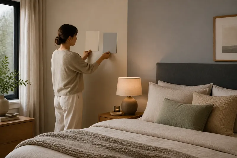
Warm or cool neutrals for a restful bedroom? Hold a cream pillow beside a gray wall in the evening, and the difference becomes immediate: one may feel soft and enveloping, the other crisp and quiet. The better choice depends less on a rule about sleep than on the atmosphere you want and the light your room receives.
What makes a neutral warm or cool?
A neutral’s undertone gives it its temperature. Warm neutrals lean toward yellow, red, or brown; cool neutrals lean toward blue, green, or violet. Beige, ivory, mushroom, taupe, gray, and white can each sit on either side, so the color name alone does not tell you how it will read.
Compare samples in the room rather than judging them against a white screen or a store display. Put paint chips beside the flooring, headboard, and bedding. A gray with a green cast can look distinctly cool next to a honey-toned wood floor, while a gray with a brown cast may feel warmer.
What mood do warm neutrals create?
Warm neutrals often make a bedroom feel sheltered, mellow, and close. Cream, sand, warm gray, and muted clay can soften the visual effect of hard surfaces such as painted walls, glass, or metal. They may suit a room where you want a cocooning mood, especially if its furnishings already include wood or other earthy colors.
The effect depends on the shade and its neighbors. A yellowed ivory beside bright white can look dingy, while a warm taupe beside oak may seem harmonious. To keep a warm palette from feeling heavy, bring in lighter textiles or a cooler accent, such as a subdued sage cushion.
What mood do cool neutrals create?
Cool neutrals often feel composed, airy, and restrained. Blue-gray, cool white, and some pale greiges can make a bedroom read clean and uncluttered, particularly when the finishes have a similar cool cast. Choose them if you prefer a quieter, more tailored appearance over a visibly cozy one.
Too many cool surfaces can make a room feel stark, especially under a blue-leaning bulb or in weak daylight. Add a tactile counterpoint rather than switching the whole palette: washed linen, a wool throw, or natural wood can bring softness without changing the wall color.
How should daylight and bulbs affect the choice?
Check a color in the light you actually live with. North-facing daylight can make colors appear cooler; warmer late-day sun can pull out yellow and red undertones. At night, a warm-white bulb may enrich beige and mute blue, while a cooler bulb can make gray seem sharper.
Use large paint samples or removable sample boards on more than one wall. Look at them in the morning, during the day, and after turning on the bedside lamps. Also check them beside the room’s fixed finishes; a floor or closet door may cast a color relationship that a small chip cannot reveal.
How can you tell which neutral works with your existing bedroom?
Start with what is staying. Floorboards, carpet, a bed frame, and window trim are larger visual anchors than a new paint color. If they have warm undertones, a warm neutral may connect them naturally; if they lean gray or blue, a cool neutral may feel more coherent. You can still mix temperatures, but give the mix a clear reason, such as warm wood against cool walls.
Imagine you have a charcoal upholstered headboard, pale oak floors, and a room that feels too chilly after dark. You could place a warm greige sample behind the headboard and compare it with a cooler gray under both daylight and the bedside lamps. If the greige makes the oak and headboard feel connected without turning yellow, it is a promising direction; if it looks muddy, return to the cooler sample and add warmth through bedding instead.
Which details help either palette feel restful?
Keep the palette restrained, but vary its surface qualities. Matte paint, brushed cotton, linen, wool, and a soft rug create differences that are visible without demanding attention. Repeating one or two colors in the duvet, curtains, or a bedside object helps the room feel considered rather than like a collection of unrelated samples.
For a warm scheme, combine a light neutral with a deeper brownish or clay note and a natural texture. For a cool scheme, pair a pale gray or white with a softened blue-gray and a tactile material that prevents the room from feeling slick. In either case, avoid choosing every surface from a single paint strip; subtle shifts in depth keep a neutral room from flattening out.
What questions should you ask before choosing?
Can warm and cool neutrals go in the same bedroom?
Yes. Let one temperature lead, then use the other as a small counterpoint in a pillow, frame, or lamp. Repeating a shared element, such as a muted value or natural texture, can make the combination feel deliberate.
Is white a warm or cool neutral?
White can have warm, cool, or nearly balanced undertones. Compare it with a sheet of plain white paper and with your bedding; if it looks creamy, pink, or blue by contrast, that cast will influence the room.
Should the walls or bedding set the palette?
Start with whichever is harder or more expensive to change. If the walls are staying, choose bedding that works with them; if you plan to repaint, use the existing bedding and floor as reference points before settling on a wall sample.
Can a cool bedroom still feel cozy?
Yes. Add softness through fabric, wood, and layered light rather than relying on a warmer wall color. A cool neutral can remain the visual base while tactile materials keep the room from feeling severe.
How do you make the final choice?
Choose the sample that makes the room’s existing finishes look intentional and gives you the mood you want in both daylight and lamplight. If you are torn, keep the largest surfaces close to a balanced neutral and express warmth or coolness through bedding and smaller accents, which are easier to change. For a restful bedroom, the most useful warm-or-cool neutral is the one that feels settled beside your actual floor, fabrics, and evening light—not the one that wins on a paint card.