How Patterned Wallpaper Changes the Way You Read a Room
Learn how patterned wallpaper changes a room’s focal point, then choose its color, scale, and placement to connect walls with furniture and art.
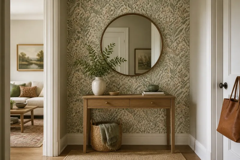
From the doorway, a narrow entry with a plain console can look like a pass-through; add patterned wallpaper behind the mirror and the same wall can read as a deliberate arrival. Patterned wallpaper changes how you read a room by directing attention, marking a zone, or giving a surface visual weight. Start with the room’s existing focal points, then choose a pattern and placement that support the effect you want.
What should patterned wallpaper change?
Choose one primary job for the paper: frame a bed, give a dining alcove its own identity, bring color to a quiet room, or establish a focal point where the room lacks one. If the wall already has a fireplace, a broad window, or prominent shelving, decide whether the paper should support that feature or compete with it for attention.
Look from the room’s usual viewpoints: the doorway, the main seat, and the route between spaces. Notice which surfaces draw the eye first. A papered wall can make a room feel more organized when its pattern clarifies a boundary; it can make the room harder to read if it obscures an existing focal point or adds visual weight to every surface.
Imagine a narrow entry with a simple console, a round mirror, and a blank wall behind them. If the goal is to make the entry feel distinct from the hall, place a small botanical pattern on that wall and leave the side walls quiet. The expected result is a clear backdrop that groups the console and mirror; the tradeoff is that the entry wall will attract more attention than the hall.
How do color, motif, and scale affect the room?
Read a wallpaper sample as a combination of background color, motif, scale, and spacing. A pale ground with dark outlines can feel more graphic than a dark ground with pale shapes, even when both use similar colors. Tight spacing tends to make a wall look busier; open spacing leaves more of the ground visible.
Consider how the pattern reads from across the room. A tiny repeat may become a textured field at a distance, while a large floral can act like the room’s main image. Neither is automatically better: choose based on whether you want the wall to recede, add quiet detail, or lead the composition.
- Background color: Hold the sample beside the floor and trim. If the ground clashes with either, choose a different colorway; if the relationship feels comfortable in the room’s light, keep it in consideration.
- Motif: Look for a shape or quality that relates to an existing rug, lamp, or artwork. If the connection feels forced, choose a pattern with a less literal motif; if it feels natural, let that shared quality link the pieces.
- Scale: Compare a motif with the nearby sofa, headboard, or artwork. If the pattern overwhelms those objects, try a smaller repeat; if it disappears from the main viewpoint, consider a larger or clearer design.
- Spacing: Check how much open ground lies between motifs. If the wall looks crowded beside the room’s other patterns, choose a more open design; if it feels too bare, consider a denser repeat.
- Contrast: View the sample beside the room’s largest furnishings. If the wallpaper and furniture compete sharply, choose a lower-contrast paper or simplify nearby patterns; if the wall needs emphasis, retain the stronger contrast and quiet the surrounding surfaces.
- Pattern direction: Check the sample’s orientation against the wall and nearby architectural lines. If the motif looks awkward at a doorway or ceiling edge, select another design or plan its placement with an installer; if it aligns well, note the direction for installation.
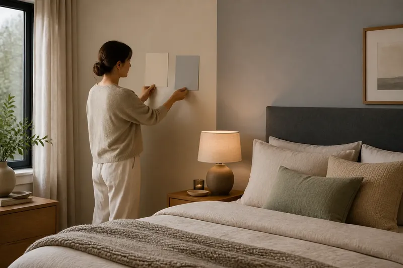
Request a sample when possible and hold it vertically against the intended wall. View it in daylight and with the room’s lamps on, then place it beside the floor, trim, upholstery, and large artwork. A flat sample can suggest the pattern’s character, but it cannot show how the full wall will dominate or recede; use the room’s actual viewpoints to make that judgment.
Where should the wallpaper start and stop?
Covering all the walls can make a repeat feel continuous and enveloping. A single wall can concentrate attention, but it works best when it frames something or gives the room a clear focal point. A recess, alcove, chimney breast, or existing wall panel offers a natural boundary for partial coverage.
On an uninterrupted wall, a sudden stopping point can look unresolved. If you want to use paper above a chair rail or inside framed panels, make sure those divisions belong to the room’s architecture. Check how much of the pattern remains visible behind furniture, lamps, and artwork; a feature wall can lose its effect if the main motif is hidden.
Look through doorways into neighboring spaces, too. If the hall already has a strong pattern, a quieter transition may let each room read clearly. A related color or shape can connect the spaces without repeating the same wallpaper.
How should furniture and art relate to the pattern?
Pull one or two colors from the paper into a cushion, ceramic vase, lampshade, or artwork, but do not match every object. A plain sofa or simple bedding can give a high-contrast wall breathing room. Against a low-contrast pattern, a woven shade or textured throw can add depth without introducing another dominant motif.
For art, check whether the image stays visible against the paper. A small print may disappear on a dense repeat; a larger, simpler image or a mat can make a clearer boundary. Hold the frame against a sample before hanging it, and decide whether the art should echo the paper, contrast with it, or sit on a quieter adjacent wall.
Finishes affect the balance as well. Glossy surfaces can make nearby colors feel sharper, while matte finishes tend to soften their presence. Woven fabric, textured wood, glass, and smooth upholstery each contribute a different kind of visual attention, so use them according to the role you want each object to play.
What should you check before ordering?
Put the wallpaper sample together with a floor or rug reference, a trim paint chip, and swatches of large upholstery. Arrange them in the room and check them from the entrance and main seat. Review the product information for repeat, direction, surface, care guidance, and installation requirements; account for windows, doors, corners, radiators, and built-ins when considering how much of the pattern will remain visible.
- Check the sample beside the floor and trim. If either pairing feels discordant, choose another colorway; if both sit comfortably together, keep the sample.
- Check the wall from the doorway and main seat. If the pattern draws attention away from a feature you want to lead, test a quieter design or another wall; if it supports that feature, retain the placement.
- Check the motif against nearby furniture and art. If the scale overwhelms or disappears beside those objects, compare another repeat size; if it remains legible, keep it in consideration.
- Mark doors, windows, corners, and built-ins on a simple wall sketch. If a prominent motif would land awkwardly at an edge, adjust the layout or select another design; if the boundaries accommodate the repeat, note the planned starting point.
- Check whether the wallpaper ends at an architectural boundary. If the edge would fall arbitrarily on a plain wall, extend coverage or choose a recess or panel; if it follows an existing division, keep that boundary.
- Check the paper’s surface and care instructions against the room’s use. If the finish is unsuitable for a high-contact area, choose a more appropriate product; if the label fits the room, follow its preparation and installation guidance.
If wall repairs or installation details are uncertain, ask a qualified wallpaper installer before ordering. The product label and manufacturer’s instructions should guide preparation, cleaning, and installation.
Which patterned wallpaper questions should you ask?
Can patterned wallpaper work in a small room?
Yes. Choose scale and contrast for the effect you want: a lively repeat can make the walls a feature, while a quieter design can keep them from dominating the room.
Should wallpaper match a rug or curtains?
Exact matching is unnecessary. A shared color, shape, or level of contrast can connect the pieces while allowing each pattern to remain distinct.
Can you hang art on patterned wallpaper?
Yes. Check that the art has enough contrast to remain visible, or use a mat and frame to define its edges. Test the arrangement against a sample or the wall before hanging it.
Is a single feature wall always the best choice?
No. Use one wall when it has a clear role, such as framing a bed or anchoring a dining table. If it feels disconnected from the rest of the room, consider a natural architectural zone or coverage that creates a more continuous composition.
How can you tell whether the room reads clearly?
Imagine you have a dining alcove with a plain wall, a wood table, and a large framed print. You want the table to feel anchored, so you compare a bold geometric sample with a quieter leaf pattern against the wall, the print, and the table. From the doorway, the geometric sample pulls attention from the artwork; the leaf pattern leaves the print legible and gives the alcove a distinct backdrop. You choose the leaf pattern for the alcove only, stopping at its existing recess. The result should make the dining area read as its own zone, though the print remains the stronger focal point.
After installation, view the room from the doorway and its main seat. If the paper hides the feature you intended to preserve, move or remove a competing object before changing the wall treatment. For a reliable patterned wallpaper choice, judge the whole arrangement together: the wall, its edges, and the objects in front of it.